Case study · Art direction · independent concept · AI
HAZEL light: the “Freshly baked” campaign concept
Personal project, not affiliated with the brand
An art direction concept for the HAZEL light palette. It started with one word on the lid.
In short
- Brand
- HAZEL light, a face palette. Personal project, not affiliated with the brand.
- Goal
- Find an image that stops the thumb and belongs only to this palette. In research, every palette looked the same.
- Idea
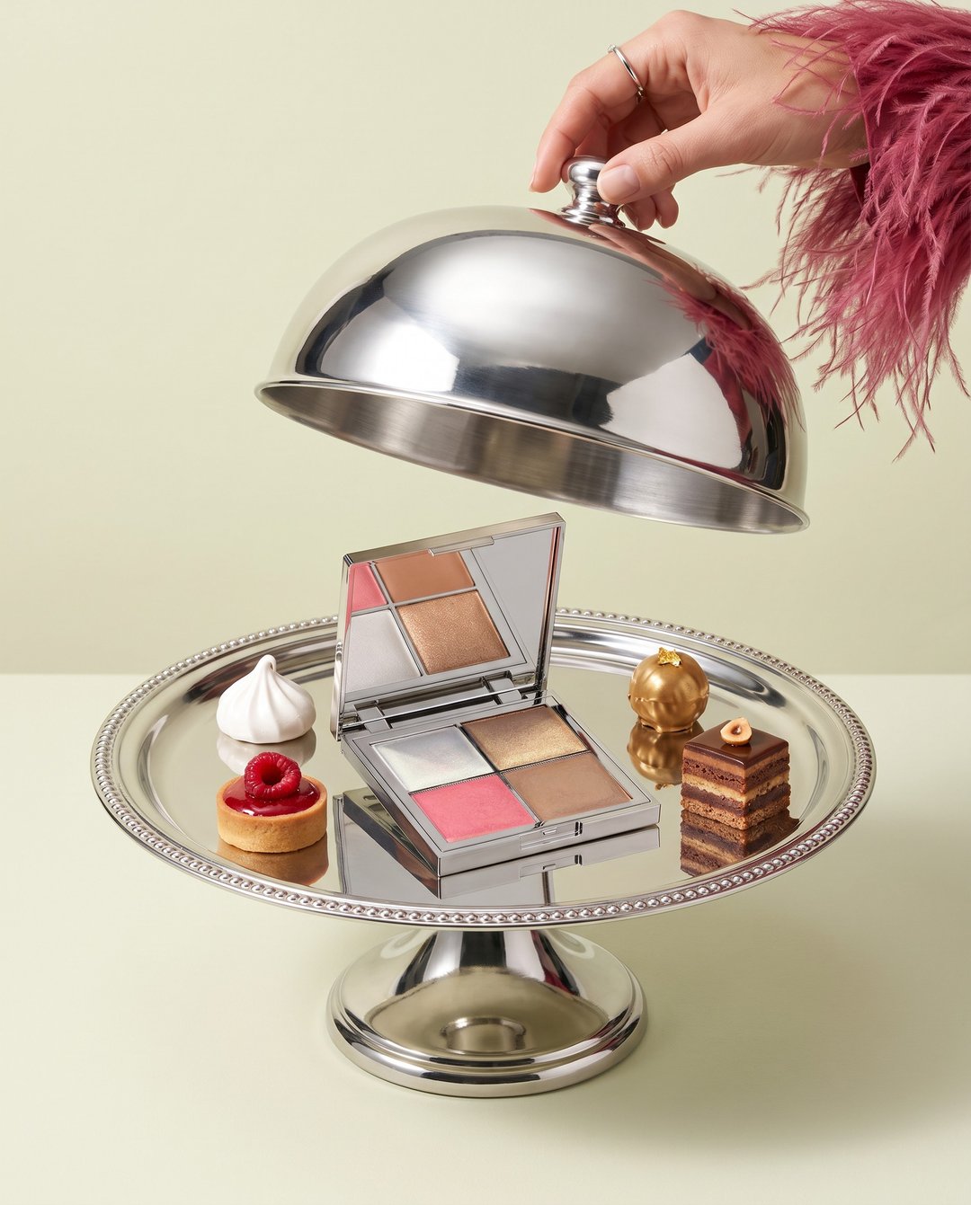
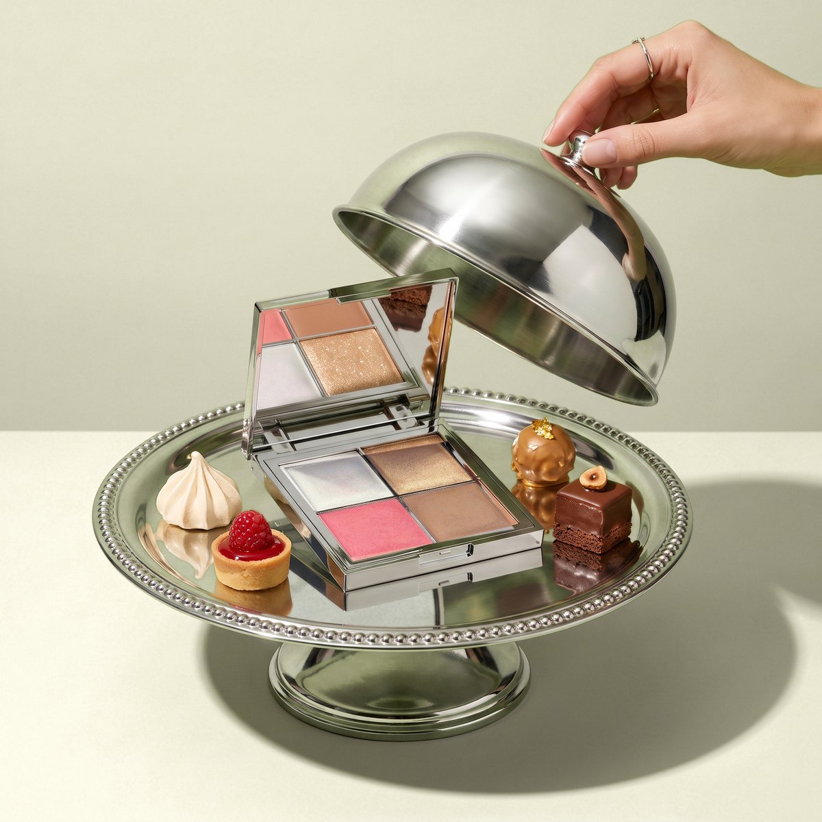
- “Freshly baked”. The lid says “baked face palette”, so the four pans become four desserts from a patisserie.
- My role
- Market research, concept, art direction, AI frames, product and print check.
- Result
- A 9-frame campaign: from the reveal under the cloche to a box straight from a patisserie.
Want something like this for your brand? Send a short brief
Start
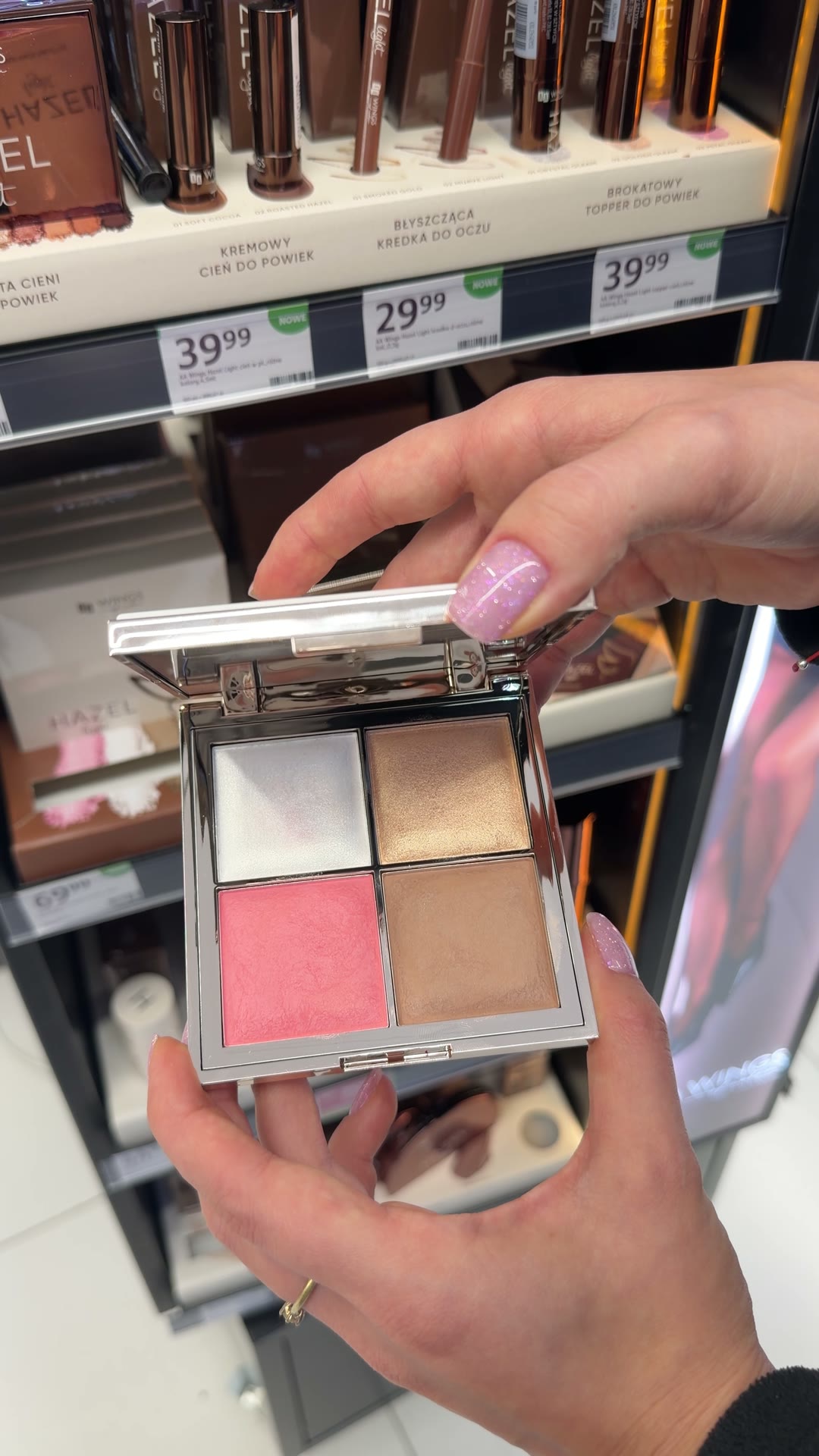
A video from the drugstore
I didn't have the palette at home. It all started with a few seconds filmed on my phone by the shelf: a chrome case, four pans and a lid with a word nobody had used yet.
Not affiliated with AA Wings of Color.
01 · The problem
Every palette looks the same
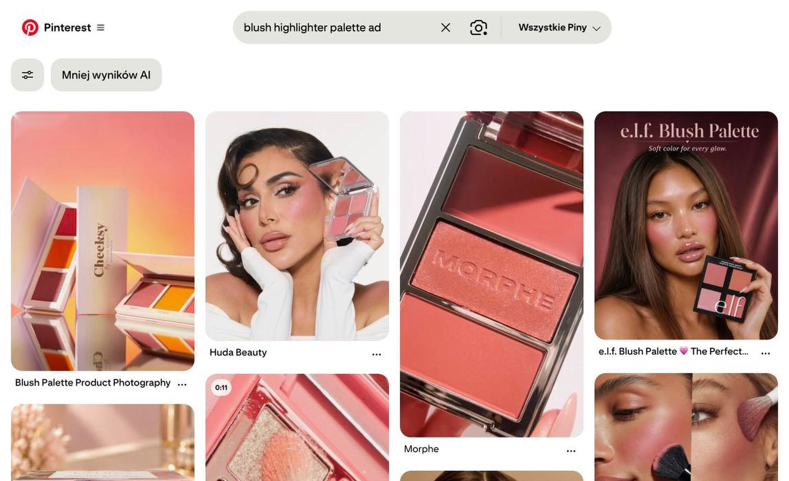
I typed into Pinterest what the brand would be looking for. Every result showed the same thing: a packshot, a face with the palette by the cheek, a brush on skin. Pink on a pink background and a line about glow. You could swap the logo and nobody would notice. I was looking for an image that stops the thumb and belongs only to this palette.
02 · What I turned down
Three directions that did not make it
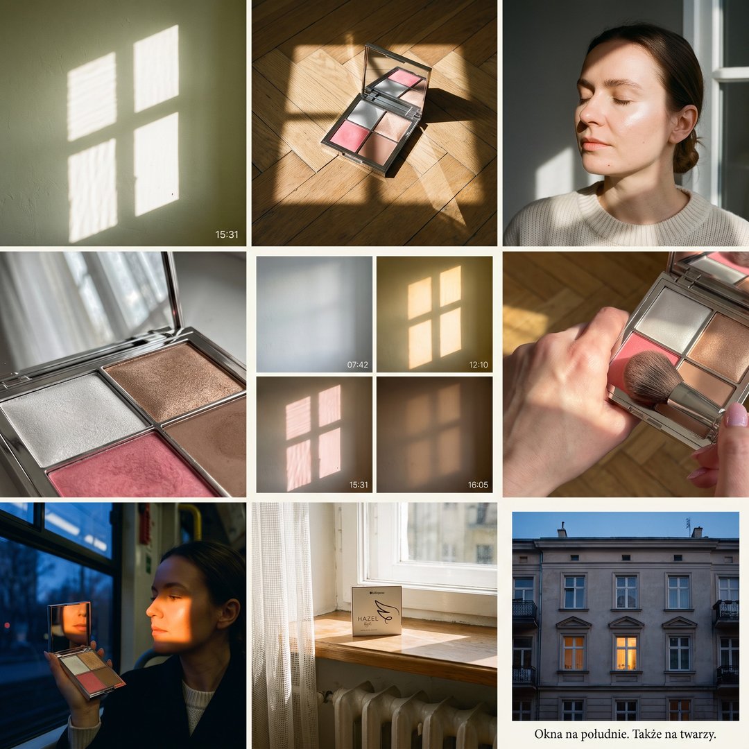
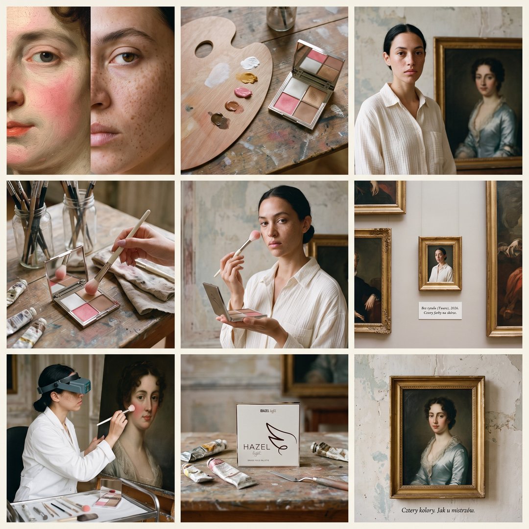
Each of these directions could have been swapped for perfume or a candle. I started with a mood, and I should have started with the product.
03 · The decision
Everything was written on the lid
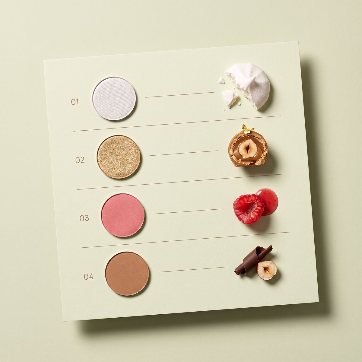
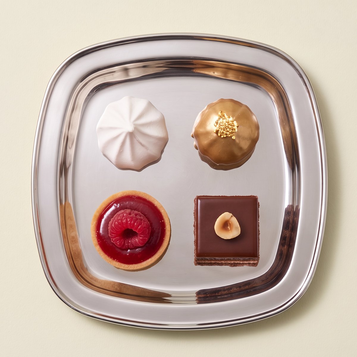
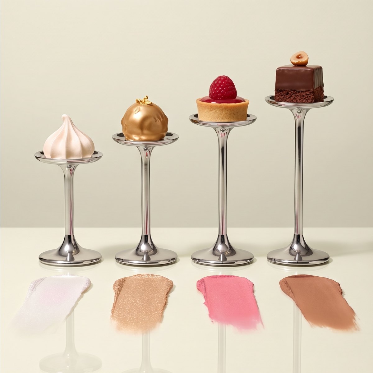
The lid says “baked face palette”, because the pans in this palette are baked. I took it literally: four pans are four desserts, and the palette is served like the best cake in a patisserie.
Less decoration, more product.
04 · Selection
A correct frame is not enough
With desserts it is easy to make a patisserie ad instead of a cosmetics one. Every frame had to carry the idea, not just look nice. I named what exactly was wrong and changed only that.
05 · What I did
Role
- Market research
- concept
- art direction
- AI frames
- product and print check
Material
AI frames made from drugstore photos of the product. The case, the four pans and the box always match the original. One rule for the whole series: pistachio cream, chrome and raspberry as the only strong accent.
Formats
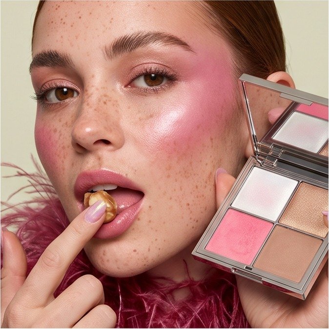
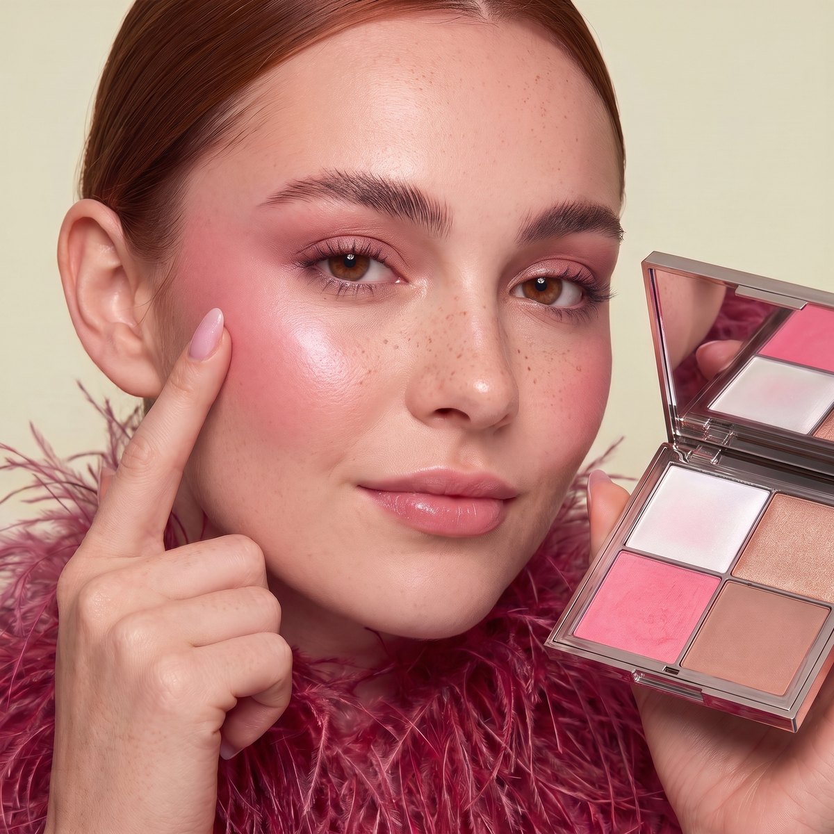
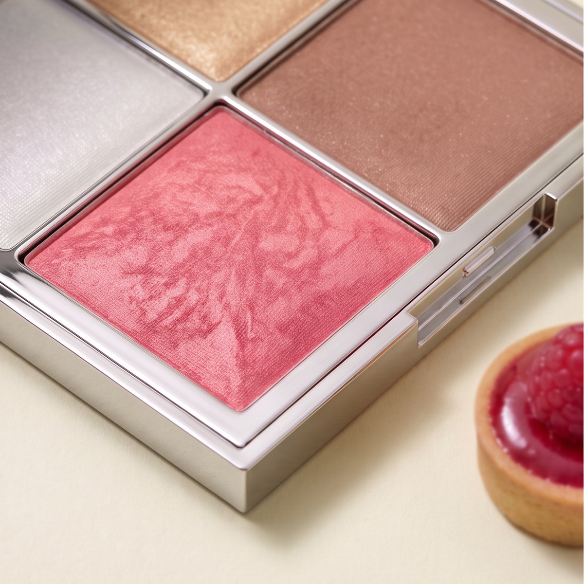
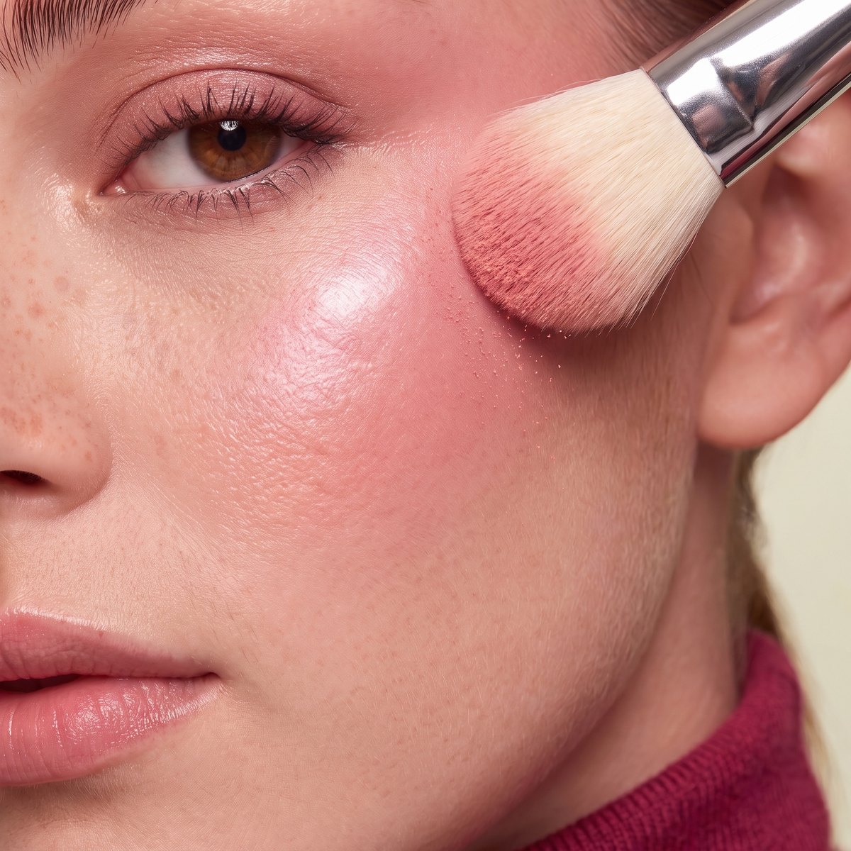
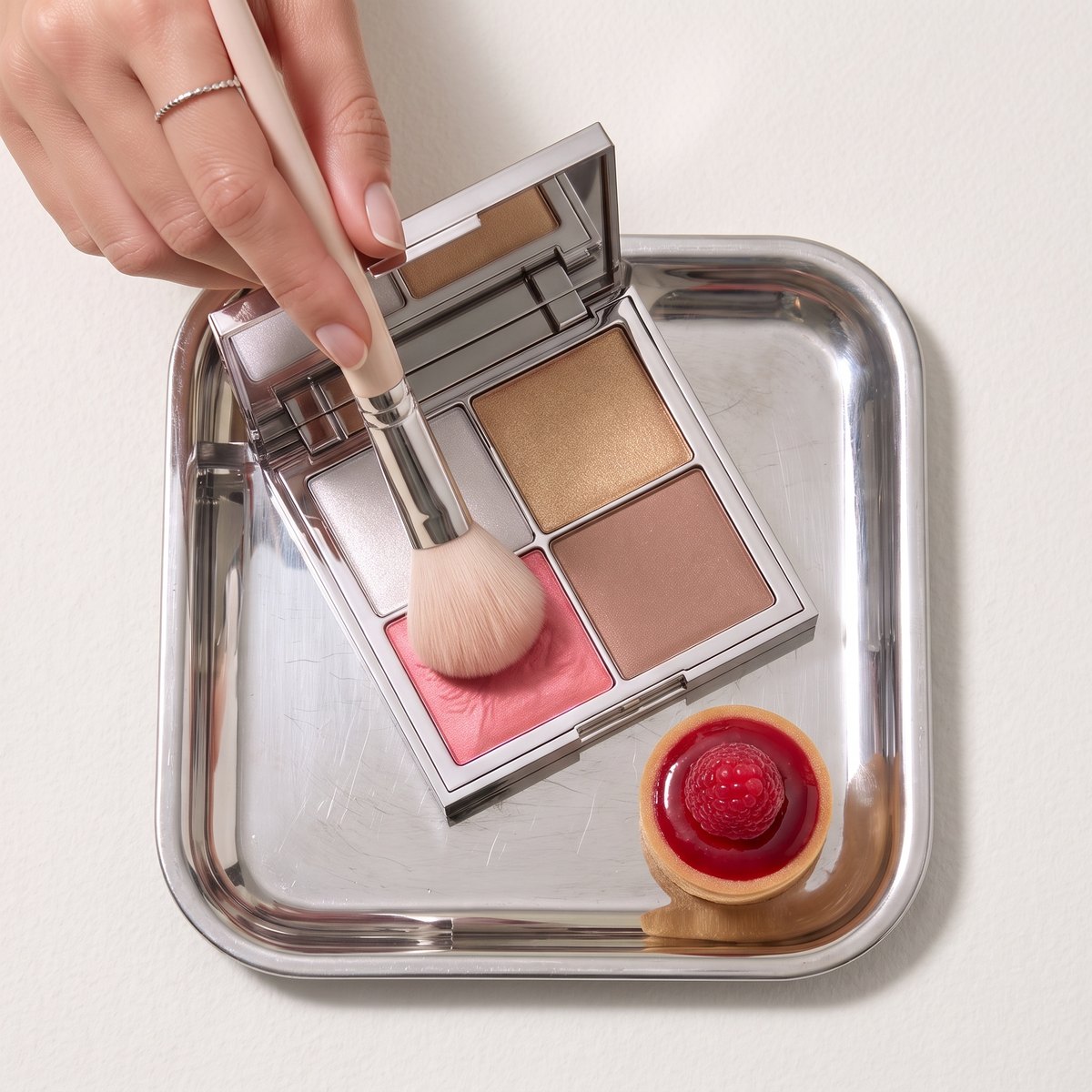
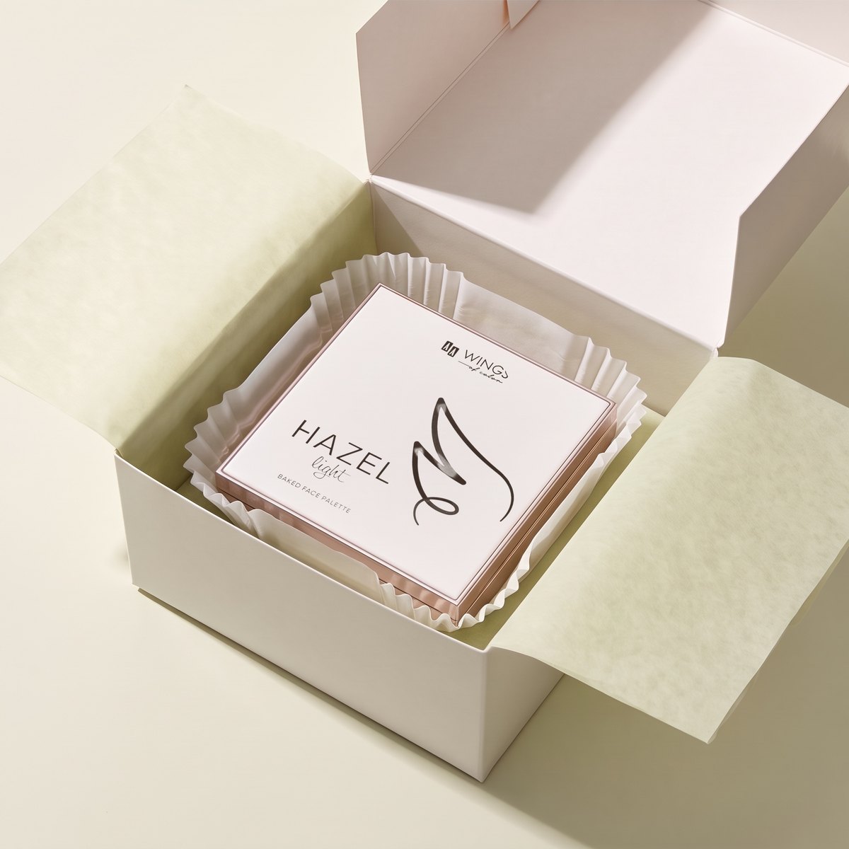
9 campaign frames: reveal from under the cloche, blush macro, brush on the cheek, recipe card, face with the palette, four desserts, application, colours on plinths, patisserie-style box.
06 · Palette (from the project images)
Colours
07 · Visuals
Frames
See also
- AI product photosPackshot and AI campaign for an online shop.
- This project on the home pageThe full portfolio with the rest of my work.
Have a similar product?
Write a few sentences: the brand and product, what content you need, where it will run and by when. I quote after a short description of the project and reply within 24 h.